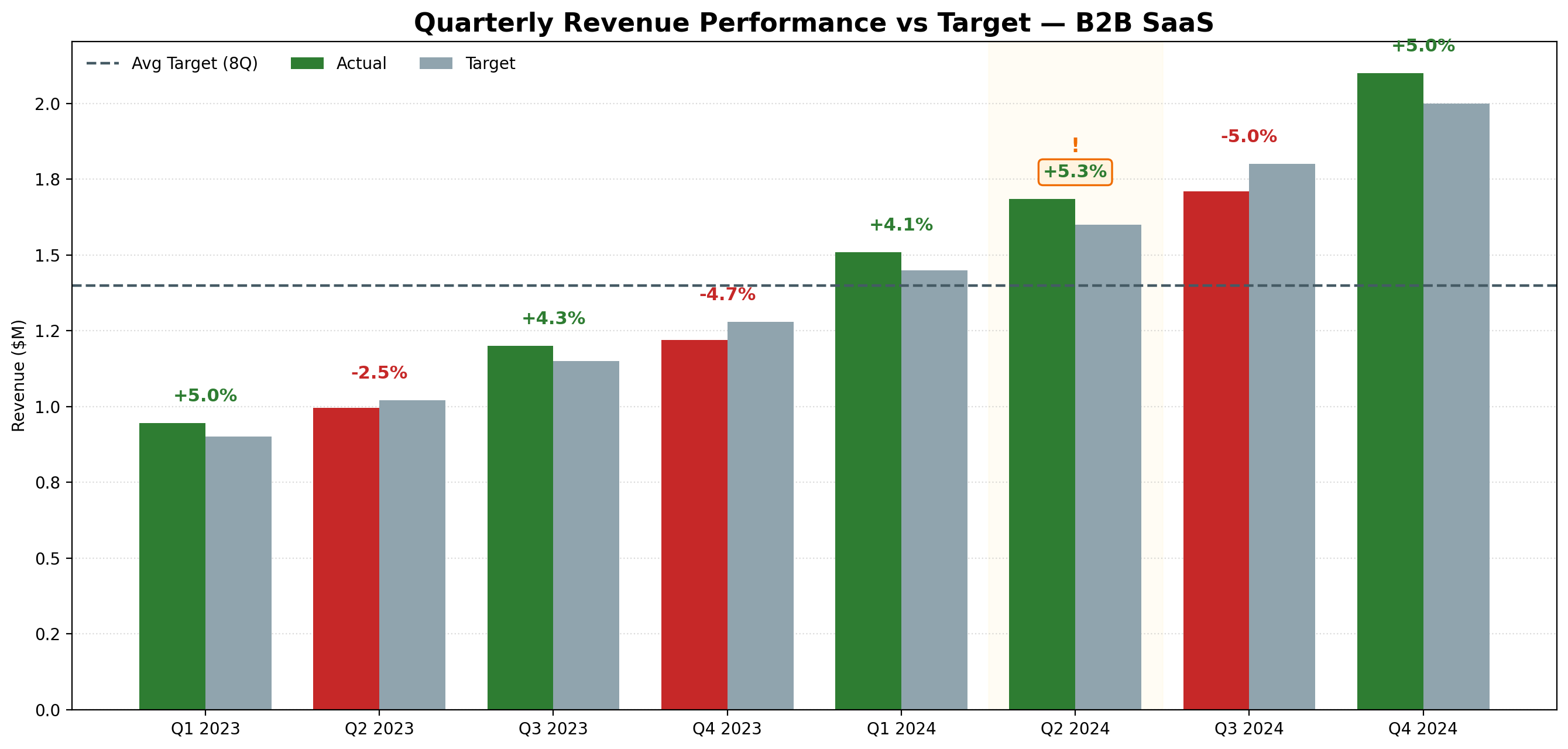
Generated with Julius AI using the prompt above. Green = above target, red = below. Exported as PNG in one click. Total time: under 30 seconds.
A practical guide for data analysts who are tired of spending 20 minutes on a chart that should take 20 seconds.
If you're a data analyst, you've been here: you have the data, you know what the chart should look like, and you're about to spend the next 15-20 minutes fighting with Excel formatting, axis labels, and color schemes just to produce something presentable.
There's a faster way. Here's exactly how to generate presentation-ready charts from your data in under 60 seconds — no Python, no formulas, no drag-and-drop.
The actual analysis — finding the insight — takes minutes. The chart production takes longer than it should. For most analysts, chart building is one of the biggest time drains in the workflow:
| Task | Time manually | Time with AI |
|---|---|---|
| Bar chart from CSV | 15-20 min | Under 30 sec |
| Cohort retention heatmap | 45-60 min | Under 60 sec |
| Multi-series line chart | 20-30 min | Under 30 sec |
| Revenue vs target grouped bars | 25-35 min | Under 30 sec |
| Total per week (5 charts) | 2-3 hours | Under 10 min |
That's not an exaggeration. Once you've done this a few times, you stop thinking of chart generation as a task — it becomes a 30-second step between your analysis and your report.
Julius AI is built specifically for data analysts. You upload your file — CSV, Excel, or connect a database — describe the chart you want in plain English, and it generates it. Behind the scenes it runs Python, but you never see any of that.
The output is a clean, presentation-ready chart you can export as PNG and drop directly into PowerPoint, Google Slides, or a report.
Try Julius AI free — Generate your first chart in under 60 seconds
You don't need a special format — plain English works. But if you want consistent, high-quality output, this structured prompt gets better results every time:
Generated with Julius AI using the prompt above. Green = above target, red = below. Exported as PNG in one click. Total time: under 30 seconds.
| Chart Type | When to Use It | Example Prompt |
|---|---|---|
| Bar chart | Comparing values across categories | "Bar chart of sales by region, sorted descending" |
| Line chart | Showing trends over time | "Line chart of monthly active users Jan-Dec 2025" |
| Cohort heatmap | Retention analysis | "Cohort retention heatmap, flag Month_3 below 40%" |
| Scatter plot | Correlation between two variables | "Scatter plot of deal size vs close rate by rep" |
| Grouped bars | Comparing multiple metrics side by side | "Grouped bars: actual vs target vs forecast by quarter" |
It's worth being clear about the limits. Julius AI is a chart and analysis tool — it's not a full BI platform:
Charts are one step. The fastest analysts use Julius AI as part of a larger workflow:
| Step | Tool | Time |
|---|---|---|
| Plan what to analyze | Claude | 2 min |
| Generate charts ⭐ | Julius AI | 5-10 min |
| Write the narrative | Claude | 5 min |
| Deliver to stakeholders | Databox | 0 min (automated) |
Try Julius AI free — Generate your first chart in under 60 seconds
Yes — Julius AI lets you upload a CSV and generate charts in plain English. No Python, no Excel formulas, no drag-and-drop. Describe the chart you want and it generates it in seconds. Try Julius AI free
Upload your dataset to Julius AI, describe the chart in one sentence, and export as PNG. The whole process takes under 60 seconds per chart — compared to 15-20 minutes in Excel. For analysts who produce 5+ charts per week, this saves 2-3 hours every week.
Yes — Julius AI accepts CSV, Excel (.xlsx), and can connect to databases. It handles multi-tab spreadsheets and lets you reference specific tabs in your prompts.
Julius AI has a free tier that lets you generate charts without a credit card. The free tier has a monthly message limit — for daily use, the paid plan at ~$20/month removes that limit. Try the free tier first
For most analyst use cases — yes. Julius runs Python behind the scenes, so you get the output without writing the code. If you need highly custom visualizations or reproducible scripts, Python is still the right tool. For day-to-day chart generation for reports and presentations, Julius AI is faster.
Get 5 Free AI Prompts for Data Analysts
Join analysts who save hours every week with AI tools.
What you get:
✓ Copy-paste ready — use today
✓ Works with Julius AI, Claude & ChatGPT
✓ Tested in real analyst workflows
✓ From an analyst with 8 years experience
⭐ Some links may be affiliate links.