How Data Analysts Can Use Databox to Build Automated KPI Dashboards
Stop rebuilding the same dashboard every week — build it once and let it run
Most data analysts rebuild the same KPI report every week. Same metrics, same format, same stakeholders — just different numbers. It's one of the biggest time drains in the job, and it's completely avoidable. Here's how to build an automated KPI dashboard in Databox that updates itself and delivers to your stakeholders automatically.
Databox is a business intelligence tool that connects to your data sources — Google Analytics, Salesforce, HubSpot, SQL databases, Sheets, and 70+ others — and displays your key metrics in a live dashboard. The dashboard updates automatically as your data changes. You build it once, and it runs forever.
For data analysts, the most valuable feature is automated report delivery: you can schedule your dashboard to be emailed to any list of stakeholders on any schedule — daily, weekly, monthly — without you touching anything.
Databox is not a visualization tool for analysts — it's a delivery tool. Its job is to get your metrics to the people who need them, automatically.
Databox connects to over 70 data sources natively. For most analysts, the relevant ones are Google Analytics, a CRM (Salesforce, HubSpot), a spreadsheet (Google Sheets, Excel), or a database via SQL query.
1
In Databox, go to Data Manager → Connect a Datasource → select your source and authenticate.
MOST USEFUL CONNECTIONS FOR DATA ANALYSTS
Google Analytics 4 → traffic, conversions, user behavior
Google Sheets → any custom data you track manually
SQL / MySQL / PostgreSQL → direct database queries
Salesforce → pipeline, revenue, customer data
HubSpot → marketing and CRM metrics
Stripe → revenue and subscription data
PRO TIP
If your main data lives in a SQL database, use Databox's SQL connector. Write your KPI query once, and Databox runs it automatically on your schedule. Your dashboard always shows the latest numbers without you running anything manually.
Step 2 — Build Your KPI Dashboard
Once your data is connected, drag and drop your metrics into a dashboard template. Databox has pre-built templates for most common use cases — sales performance, marketing analytics, financial KPIs — so you don't need to start from scratch.
2
Use this structured prompt with Julius AI to visualize your KPI performance before building in Databox:
ANALYST PROMPT — COPY & PASTE INTO JULIUS AI
TASK: Build a KPI performance scorecard for a B2B SaaS company
DATA: Connect your CSV or database — columns needed: Metric, Current_Value, Target, Previous_Period
OUTPUT: Horizontal bar chart showing % of target achieved per KPI
FLAG: Highlight metrics more than 10% below target in red
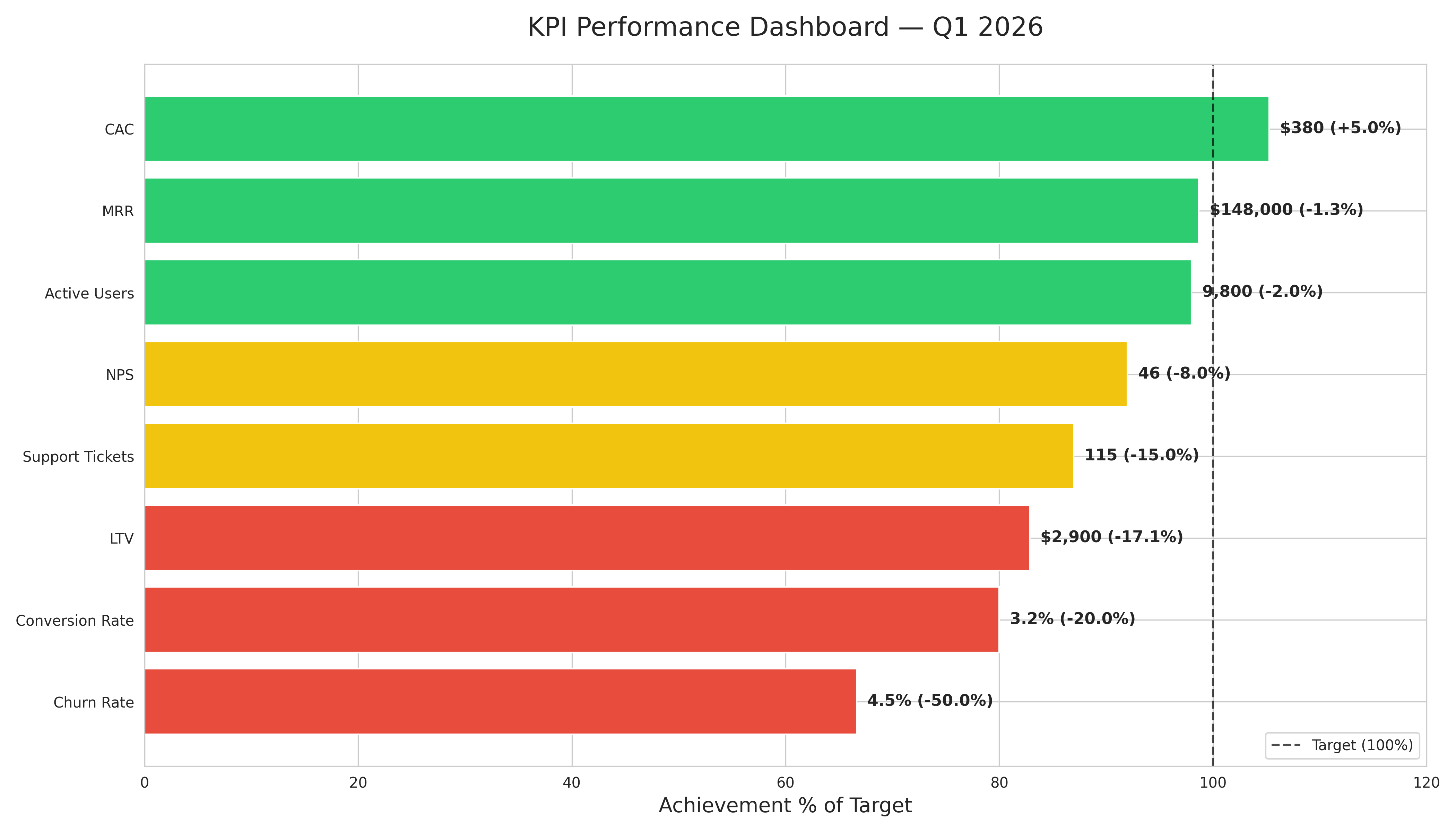
1. DATASET — 8 KPIs: MRR, Churn Rate, NPS, CAC, LTV, Conversion Rate, Active Users, Support Tickets · each with Current_Value and Target
2. CALCULATION — Variance % per metric · flag as On Track / At Risk / Off Track · rank best to worst
3. VISUALIZATION — Horizontal bars · green (above 90% of target) · yellow (75-90%) · red (below 75%) · vertical line at 100% target · label with actual value and variance % · title: "KPI Performance Dashboard — Q1 2026"
4. INSIGHT — Top 2 performing metrics · bottom 2 needing attention · one overall recommendation · max 3 bullet points
Result: Generated in under 15 seconds — Julius AI identified CAC and MRR as on track, while Churn Rate and Conversion Rate are significantly below target and need immediate attention.
Green = on track (above 90% of target). Yellow = at risk (75-90%). Red = off track (below 75%). Use this chart to decide which metrics to feature prominently in your Databox dashboard.
Before building your Databox dashboard, use Julius AI to identify which metrics need the most visibility. Metrics in red should be front and center — not buried in a tab nobody opens.
Step 3 — Set Up Genie, Databox's AI Analyst
Databox has a built-in AI feature called Genie that analyzes your dashboard data and generates plain-English summaries. Instead of your stakeholders staring at numbers, Genie tells them what changed and why it matters.
3
Enable Genie in your dashboard settings and configure it to generate weekly summaries.
WHAT GENIE DOES
Genie scans your dashboard metrics, identifies significant changes, and writes a plain-English summary automatically. Your stakeholders get: "Revenue is up 12% this week, driven by a 23% increase in enterprise deals. The conversion rate dropped slightly — worth watching next week." No analyst needed for the summary.
This is the step that makes everything passive. Schedule your dashboard to be delivered to your stakeholders automatically — they get the report in their inbox without you sending anything.
4
In Databox, go to Scheduled Reports → New Report → select your dashboard → add recipients → set schedule.
RECOMMENDED DELIVERY SCHEDULE
Weekly KPI report → Monday 8:00 AM (stakeholders start the week informed)
Monthly summary → First Monday of the month
Daily metrics → Only if stakeholders actively use the numbers daily
Real-time alerts → For metrics with clear thresholds (e.g. "alert if conversion drops below 2%")
WHAT YOU GET
Your stakeholders receive a professional, up-to-date dashboard every Monday morning. You set this up once — it runs every week indefinitely. The time saved compounds: 45 minutes per week × 52 weeks = 39 hours per year returned to your calendar.
What is Databox and how does it help data analysts?
Databox is a BI tool that connects to your data sources and delivers automated dashboards to your stakeholders on any schedule. For analysts, the key benefit is eliminating the manual work of rebuilding and sending the same report every week. Try Databox free — Get your first KPI dashboard live in under 2 hours
How long does it take to set up a Databox dashboard?
Most analysts set up their first dashboard in 2-3 hours. That includes connecting data sources, building the layout, and scheduling delivery. After that, it runs automatically with zero ongoing effort.
What data sources does Databox connect to?
Databox connects to 70+ data sources including Google Analytics, Salesforce, HubSpot, SQL databases, Google Sheets, Stripe, and more. If your data is in a SQL database, you can write a custom query and Databox will run it automatically on your schedule.
What is Databox Genie?
Genie is Databox's built-in AI analyst. It automatically scans your dashboard metrics, identifies significant changes, and writes a plain-English summary for your stakeholders — so they understand what happened without needing to interpret the numbers themselves. Try Databox Genie — Get instant AI insights from your KPIs
Get 5 Free AI Prompts for Data Analysts
Join analysts who save hours every week with AI tools.