Claude + Julius AI + Databox — a workflow that replaces 4 hours of work with 45 minutes
Most data analysts use AI tools one at a time — Claude for writing, Julius AI for charts, and something else for reporting. What if you combined them into a single workflow? Here's the stack I use for every analysis project, and the exact prompts that make it work.
Before touching your data, use Claude to build a thinking framework. This prevents you from going down rabbit holes and keeps your analysis focused on what stakeholders actually need.
1
Open Claude and paste this prompt, replacing the bracketed parts with your actual project details.
PROMPT — COPY AND USE THIS
I'm a data analyst working on [project type, e.g. "monthly sales performance analysis"]. My stakeholders are [audience, e.g. "VP of Sales and regional managers"].
Help me:
1. Identify the 5 most important questions this analysis should answer
2. Suggest the key metrics I should focus on
3. Draft an outline for the final report (executive summary + 3 sections + recommendations)
Keep everything focused on business impact, not technical details.
WHAT YOU GET
Claude returns a structured analysis framework in under 30 seconds. You now know exactly what to look for in your data — before you've opened a single spreadsheet. This alone saves 30-45 minutes of unfocused exploration.
Step 2 — Use Julius AI to Generate the Charts
With your analysis framework ready, upload your dataset to Julius AI and generate charts using plain English. No formulas, no formatting — just describe what you want.
2
Upload your CSV or Excel file to Julius AI, then use this structured prompt:
ANALYST PROMPT — COPY & PASTE INTO JULIUS AI
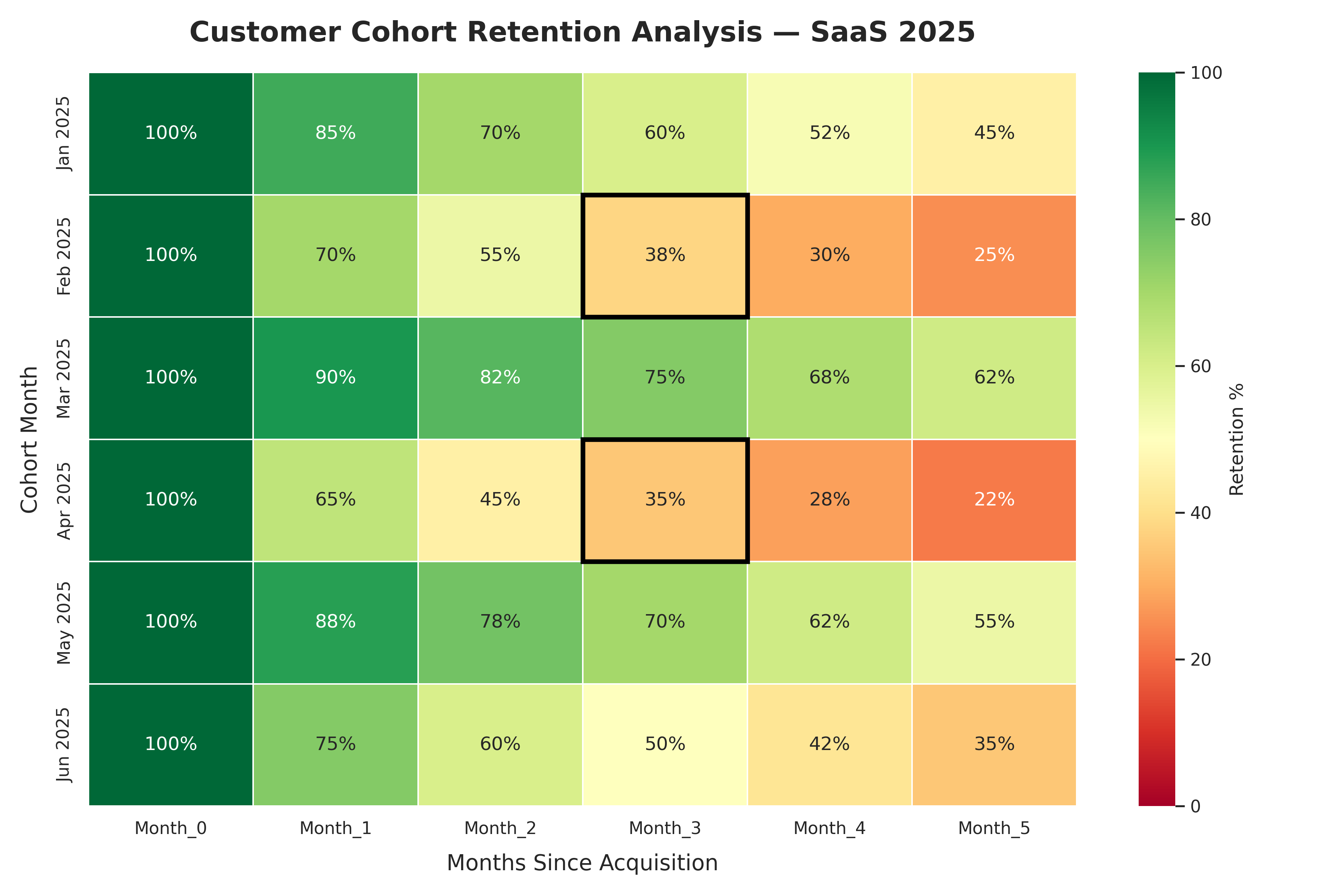
TASK: Analyze customer cohort retention for a SaaS product
DATA: Connect your CSV or database — columns needed: Cohort_Month, Month_0 through Month_5
OUTPUT: Cohort retention heatmap with color-coded performance
FLAG: Highlight cohorts where Month_3 retention drops below 40%
1. DATASET — 6 monthly cohorts (Jan–Jun 2025) · Month_0 = 100% · realistic retention decline · at least 2 cohorts below 40% at Month_3
2. CALCULATION — Retention % per cohort per month · average retention per month · identify best and worst cohort
3. VISUALIZATION — Heatmap: rows = cohorts, columns = months · dark green (high) to dark red (low) · % values inside each cell · title: "Customer Cohort Retention Analysis — SaaS 2025"
4. INSIGHT — Best cohort at Month_3 · overall retention trend · one recommendation · max 3 bullet points
Result: Generated in under 15 seconds — Julius AI identified Feb and Apr 2025 cohorts as underperforming (38% and 35% retention at Month_3), while Mar 2025 was the strongest cohort at 75%.
Dark green = high retention. Dark red = below 40% threshold (flagged with black border). Mar 2025 cohort is the clear outperformer. No formulas, no drag and drop.
WHAT YOU GET
Presentation-ready charts in 15-30 seconds each. Export them as PNG and drop them directly into your report or Databox dashboard.
Charts tell you what happened. Claude explains why it matters and what to do about it.
3
Paste your key findings into Claude with this prompt:
PROMPT — COPY AND USE THIS
Here are the key findings from my [project type] analysis:
- [Finding 1]
- [Finding 2]
- [Finding 3]
My audience is [stakeholder type]. Write:
1. A 3-sentence executive summary focused on business impact
2. A "so what" explanation for each finding (1-2 sentences each)
3. Two concrete recommendations with expected outcomes
Use plain language. No jargon. Focus on what they should do, not what the data shows.
WHAT YOU GET
A complete written narrative ready to paste into your report. The executive summary alone typically takes analysts 20-30 minutes to write from scratch. Claude does it in seconds.
Step 4 — Set Up Automated Delivery with Databox
This is the step most analysts skip — and it's where the biggest time savings are. If you're delivering the same KPIs to the same people every week, automate it.
4
Connect your data source to Databox, build your dashboard once, and schedule automatic delivery.
HOW TO SET IT UP
1. Connect your data source (Google Analytics, SQL, Sheets, HubSpot, Salesforce, or 70+ others)
2. Drag and drop your key metrics into a dashboard template
3. Set a delivery schedule (daily, weekly, monthly)
4. Add your stakeholders' emails
5. Done — it runs forever without you touching it
WHAT YOU GET
Your stakeholders receive an automated email with your key metrics every week — without you sending anything. One setup session saves you 30-60 minutes every single week, indefinitely.
Each tool fills a gap the others leave. Claude is a thinking partner — it doesn't touch your data but it structures your thinking and writes your words. Julius AI is a visualization engine — it turns raw data into charts without formulas or drag-and-drop. Databox is a delivery system — it gets your insights to the people who need them without you manually sending anything.
No single tool does all three. But together, they cover everything.
This is the stack I'd recommend to any analyst who wants to produce better work faster and spend less time on delivery. Start with Claude for free, add Julius AI for charts, and add Databox when you're ready to automate delivery.
What is the best AI tool for data visualization and chart generation?
Julius AI is purpose-built for data analysts. Upload your dataset, describe the chart in plain English, and it generates presentation-ready charts in under 15 seconds — no Excel formulas, no Tableau. Try Julius AI free — Turn raw data into charts in seconds
How do I automate KPI dashboard delivery to stakeholders?
Databox connects to your data sources, lets you build a dashboard once, and delivers it automatically to your stakeholders on any schedule. Set it up in about 2 hours — then it runs every week without you touching anything. Try Databox free — Build dashboards once, track everything automatically
Can I use this stack with my existing data tools?
Yes. Databox connects to 70+ data sources including Google Analytics, Salesforce, HubSpot, SQL databases, and Google Sheets. Julius AI accepts CSV uploads and connects to most databases. Claude works with any text or data you paste in.
How much does this stack cost?
You can start entirely free. Claude has a generous free tier. Julius AI has a free tier for basic use. Databox has a free plan for up to 3 data sources. Paid plans start at around $20-37/month per tool — the time savings typically pay for themselves in the first week.
How do I set up an AI analytics stack that works across tools without vendor lock-in?
The key is to use tools that each do one job well and connect cleanly: Claude for analysis structure and writing, Julius AI for chart generation, and Databox for automated dashboard delivery. None of these tools lock your data in — you can export from any of them at any time. Start with Claude (free), add Julius AI when you need charts, and add Databox when you're ready to automate delivery to stakeholders.
Get 5 Free AI Prompts for Data Analysts
Join analysts who save hours every week with AI tools.